With the outbreak of COVID-19 one thing that is certain is that never before a virus has gone so much viral on the internet. Especially, a lot of data about the spread of the virus is going around.
In the space of a few weeks, complex terms like “group immunity” (herd immunity) or “flattening the curve” started to circulate on social networks.
Day<-1:(length(Infected))#N <- 1400000000 # population of mainland chinaN<-10276617# população de Portugal do INERSS<-function(parameters){names(parameters)<-c("beta","gamma")out<-ode(y=init,times=Day,func=SIR,parms=parameters)fitInfected<-out[,3]sum((Infected-fitInfected)^2)}SIR<-function(time,state,parameters){par<-as.list(c(state,parameters))with(par,{dS<--beta/N*I*SdI<-beta/N*I*S-gamma*Ilist(c(dS,dI))})}SIR2<-function(time,state,parameters){par<-as.list(c(state,parameters))with(par,{dS<-I*K*(-S/N*R0/(R0-1))dI<-I*K*(S/N*R0/(R0-1)-1/(R0-1))list(c(dS,dI))})}RSS2<-function(parameters){names(parameters)<-c("K","R0")out<-ode(y=init,times=Day,func=SIR2,parms=parameters)fitInfected<-out[,3]#fitInfected <- N-out[,2]sum((Infected-fitInfected)^2)}### Two functions RSS to do the optimization in a nested wayInfected_MC<-InfectedSIRMC2<-function(R0,K){parameters<-c(K=K,R0=R0)out<-ode(y=init,times=Day,func=SIR2,parms=parameters)fitInfected<-out[,3]#fitInfected <- N-out[,2]RSS<-sum((Infected_MC-fitInfected)^2)return(RSS)}SIRMC<-function(K){optimize(SIRMC2,lower=1,upper=10^5,K=K,tol=.Machine$double.eps)$objective}###### wrapper to optimize and return estimated valuesgetOptim<-function(){opt1<-optimize(SIRMC,lower=0,upper=1,tol=.Machine$double.eps)opt2<-optimize(SIRMC2,lower=1,upper=10^5,K=opt1$minimum,tol=.Machine$double.eps)return(list(RSS=opt2$objective,K=opt1$minimum,R0=opt2$minimum))}# starting conditioninit<-c(S=N-Infected[1],I=Infected[1]-R[1]-D[1])#init <- c(S = N-Infected[1], I = Infected[1])
Result of estimation of the reproduction number (R0)
The current model gives: R0 = 1.0620105 as we see the result is quite different.
Some differences of the SIR model
This SIR model uses the parameters $K = \beta - \gamma$ and $R_0 = \frac{\beta}{\gamma}$
Opt_par3<-setNames(Opt3[2:3],c("K","R0"))Opt_par3
## $K
## [1] 0.2632098
##
## $R0
## [1] 1.06201
# plotting the resultt<-1:80# time in daysfit3<-data.frame(ode(y=init,times=t,func=SIR2,parms=Opt_par3))par(mar=c(1,2,3,1.1))# Set the margin on all sides to 2# par(mar = c(bottom, left, top, right))old<-par(mfrow=c(1,1))#Opt3 <- getOptim()#Opt_par3 <- setNames(Opt3[2:3], c("K", "R0"))Opt_par3
## $K
## [1] 0.2632098
##
## $R0
## [1] 1.06201
##############from_date<-dmy("02/03/2020")sir_start_date<-"2020-03-02"height_pand<-fit3[fit3$I==max(fit3$I),"I",drop=FALSE]# height of pandemicheight_pand
max_infected<-max(fit3$I)height_of_pandemic<-max_infectedforecast_infections<-fit3$Imax_infected_day<-from_date+height_day# height of pandemicmax_infected_day
## [1] "2020-04-12"
# [1] "2020-04-11"height_of_pandemic_date<-max_infected_dayactual_infections<-Infecteddays_from_inic<-data.frame(date=as.Date(from_date+t))#fit_i<-fit3%>%cbind(days_from_inic)fit_i$actual_infections<-c(Infected,rep(NA,nrow(fit_i)-length(Infected)))#full_forecast_plot<-fit_i%>%# output_dfggplot(aes(x=date))+geom_line(aes(y=I/1000),colour="blue")+geom_point(aes(y=actual_infections/1000),colour="red")+geom_vline(xintercept=height_of_pandemic_date,line_type="dotted")+annotate(geom="text",x=height_of_pandemic_date,y=(height_of_pandemic/1000)/2,inherits=FALSE,label=str_glue("Max. infections of {comma(height_of_pandemic / 1000, accuracy = 0.01)} on {height_of_pandemic_date}"),color="black",angle=90,vjust=-0.25,size=3)+# size = 4theme_bw()+xlab("")+ylab("Number of Infections - Thousands")+scale_x_date(breaks=scales::pretty_breaks(n=12))+# for one year date labelsscale_y_continuous(label=comma)+ggtitle(label="Portugal - Corona Virus Infections Forecast",subtitle="Blue Points are Forecast and Red Points are Actuals")# caption = "Data: https://github.com/CSSEGISandData/COVID-19")full_forecast_plot
height_of_pandemic_date
## [1] "2020-04-12"
Final conclusions
Based on this model the peak of the epidemic has already happened on day 2020-04-12 with a maximum of 17 870.
This is all we want, but it doesn’t mean it is correct.
Just because we use a mathematical model does not mean that our conclusions/predictions are trustworthy. We need to challenge the premises which are the underlying data and models.
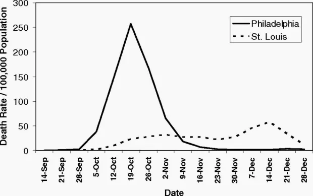
The world of 2020 is vastly different from 1918, the year Spanish flu began to spread around the world. By 1920, Spanish flu is thought to have claimed the lives of up to 100 million people. But, as science writer and journalist Laura Spinney notes, many of the public health measures were similar to measures governments are taking today.
This chart of the 1918 Spanish flu shows why social distancing works
In 1918, the city of Philadelphia threw a parade that killed thousands of people. Ignoring warnings of influenza among soldiers preparing for World War I, the march to support the war effort drew 200,000 people who crammed together to watch the procession. Three days later, every bed in Philadelphia’s 31 hospitals was filled with sick and dying patients, infected by the Spanish flu.
By the end of the week, more than 4,500 were dead in an outbreak that would claim as many as 100 million people worldwide. By the time Philadelphia’s politicians closed down the city, it was too late.
Proceedings of the National Academy of Sciences
A different story played out in St. Louis, just 900 miles away. Within two days of detecting its first cases among civilians, the city closed schools, playgrounds, libraries, courtrooms, and even churches. Work shifts were staggered and streetcar ridership was strictly limited. Public gatherings of more than 20 people were banned.
The extreme measures—now known as social distancing, which is being called for by global health agencies to mitigate the spread of the novel coronavirus—kept per capita flu-related deaths in St. Louis to less than half of those in Philadelphia, according to a 2007 paper in the Proceedings of the National Academy of Sciences.
What The 1918 Flu Pandemic Teaches Us About The Coronavirus Outbreak
Reducing the basic reproduction number by drastically reducing contacts or quickly isolating infectious diseases also reduces the size of the outbreak.
Using a simple model to illustrate this point.
The SIR model
The SIR model is one of the simplest compartmental models, and many models are derivatives of this basic form.
The model consists of three compartments: S for the number of susceptible, I for the number of infectious, and R for the number of recovered or deceased (or immune) individuals.
Each member of the population typically progresses from susceptible to infectious to recovered. This can be shown as a flow diagram in which the boxes represent the different compartments and the arrows the transition between compartments, i.e.
To model the dynamics of the outbreak we need three differential equations, one for the change in each group, where $\beta$ is the parameter that controls the transition between S and I and $\gamma$ which controls the transition between and :
To fit the model to the data we need two things: a solver for differential equations and an optimizer. To solve differential equations the function ode from the deSolve package (on CRAN) is an excellent choice, to optimize we will use the optim function from base R. Concretely, we will minimize the sum of the squared differences between the number of infected I at time t and the corresponding number of predicted cases by our model Î(t):
$RSS(\beta, \gamma )=\sum_{t}(I(t) - Î(t)^2$
Putting it all together:
library(deSolve)init<-c(S=N-Infected[1],I=Infected[1],R=0)RSS<-function(parameters){names(parameters)<-c("beta","gamma")out<-ode(y=init,times=Day,func=SIR,parms=parameters)fit<-out[,3]sum((Infected-fit)^2)}Opt<-optim(c(0.5,0.5),RSS,method="L-BFGS-B",lower=c(0,0),upper=c(1,1),control=list(parscale=c(10^-4,10^-4)))# optimize with some sensible conditionsOpt$message
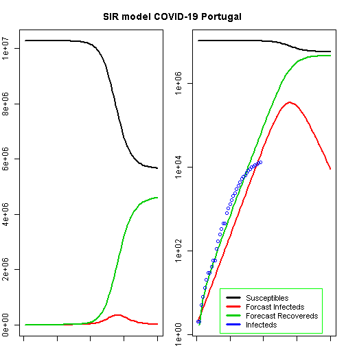
t<-1:80# time in daysfit<-data.frame(ode(y=init,times=t,func=SIR,parms=Opt_par))col<-1:4# colourold<-par(mfrow=c(1,2))# Plot Marginspar(mar=c(1,2,3,1))# Set the margin on all sides to 2# par(mar = c(bottom, left, top, right))matplot(fit$time,fit[,2:4],type="l",xlab="Day",ylab="Number of subjects",lwd=2,lty=1,col=col)matplot(fit$time,fit[,2:4],type="l",xlab="Day",ylab="Number of subjects",lwd=2,lty=1,col=col,log="y")points(Day,Infected,col="blue")legend("bottomleft",c("Susceptibles","Forcast Infecteds","Forecast Recovereds","Infecteds"),cex=0.9,lty=1,lwd=3,col=col,inset=c(0.19,0.01),box.col="green")title("SIR model COVID-19 Portugal",outer=TRUE,line=-2)
We can now extract some interesting statistics. One important number is the so-called basic reproduction number (also basic reproduction ratio) $R_0$ (pronounced “R naught”) which basically shows how many healthy people get infected by a sick person on average:
$R_0 = \frac{\beta}{\gamma}$
max_infected_day<-from_date+height_day# height of pandemicmax_infected_day
## [1] "2020-04-28"
max_infected*0.06# cases with need for intensive care
## [1] 19841.85
max_deaths<-max(fit$I)*0.02# max deaths with supposed 2% fatality ratemax_deaths
## [1] 6613.95
According to this model, the height of a possible pandemic would be reached by 2020-04-28 (57 days after it started). About 330 698 people would be infected by then, which translates to about 66 140 severe cases, about 19 842 cases in need of intensive care and up to 6 614 deaths.
Those are the numbers our model produces and nobody knows whether they are correct while everybody hopes they are not.
Do not panic! All of this is hopefully (probably!) false. When you play along with the above model you will see that the fitted parameters are far from stable…
The world of 2020 is vastly different from 1918, the year Spanish flu began to spread around the world. By 1920, Spanish flu is thought to have claimed the lives of up to 100 million people. But, as science writer and journalist Laura Spinney notes, many of the public health measures were similar to measures governments are taking today.
This chart of the 1918 Spanish flu shows why social distancing works
In 1918, the city of Philadelphia threw a parade that killed thousands of people. Ignoring warnings of influenza among soldiers preparing for World War I, the march to support the war effort drew 200,000 people who crammed together to watch the procession. Three days later, every bed in Philadelphia’s 31 hospitals was filled with sick and dying patients, infected by the Spanish flu.
By the end of the week, more than 4,500 were dead in an outbreak that would claim as many as 100 million people worldwide. By the time Philadelphia’s politicians closed down the city, it was too late.
Proceedings of the National Academy of Sciences
A different story played out in St. Louis, just 900 miles away. Within two days of detecting its first cases among civilians, the city closed schools, playgrounds, libraries, courtrooms, and even churches. Work shifts were staggered and streetcar ridership was strictly limited. Public gatherings of more than 20 people were banned.
The extreme measures—now known as social distancing, which is being called for by global health agencies to mitigate the spread of the novel coronavirus—kept per capita flu-related deaths in St. Louis to less than half of those in Philadelphia, according to a 2007 paper in the Proceedings of the National Academy of Sciences.
What The 1918 Flu Pandemic Teaches Us About The Coronavirus Outbreak
Reducing the basic reproduction number by drastically reducing contacts or quickly isolating infectious diseases also reduces the size of the outbreak.
Using a simple model to illustrate this point.
The SIR model
The SIR model is one of the simplest compartmental models, and many models are derivatives of this basic form.
The model consists of three compartments: S for the number of susceptible, I for the number of infectious, and R for the number of recovered or deceased (or immune) individuals.
Each member of the population typically progresses from susceptible to infectious to recovered. This can be shown as a flow diagram in which the boxes represent the different compartments and the arrows the transition between compartments, i.e.
To model the dynamics of the outbreak we need three differential equations, one for the change in each group, where $\beta$ is the parameter that controls the transition between S and I and $\gamma$ which controls the transition between and :
To fit the model to the data we need two things: a solver for differential equations and an optimizer. To solve differential equations the function ode from the deSolve package (on CRAN) is an excellent choice, to optimize we will use the optim function from base R. Concretely, we will minimize the sum of the squared differences between the number of infected I at time t and the corresponding number of predicted cases by our model Î(t):
$RSS(\beta, \gamma )=\sum_{t}(I(t) - Î(t)^2$
Putting it all together:
library(deSolve)init<-c(S=N-Infected[1],I=Infected[1],R=0)RSS<-function(parameters){names(parameters)<-c("beta","gamma")out<-ode(y=init,times=Day,func=SIR,parms=parameters)fit<-out[,3]sum((Infected-fit)^2)}Opt<-optim(c(0.5,0.5),RSS,method="L-BFGS-B",lower=c(0,0),upper=c(1,1),control=list(parscale=c(10^-4,10^-4)))# optimize with some sensible conditionsOpt$message
## beta gamma## 1.0000000 0.7523632t<-1:80# time in daysfit<-data.frame(ode(y=init,times=t,func=SIR,parms=Opt_par))col<-1:4# colourold<-par(mfrow=c(1,2))# Plot Marginspar(mar=c(1,2,3,1))# Set the margin on all sides to 2# par(mar = c(bottom, left, top, right))matplot(fit$time,fit[,2:4],type="l",xlab="Day",ylab="Number of subjects",lwd=2,lty=1,col=col)matplot(fit$time,fit[,2:4],type="l",xlab="Day",ylab="Number of subjects",lwd=2,lty=1,col=col,log="y")## Warning in xy.coords(x, y, xlabel, ylabel, log = log): 1 y value <= 0## omitted from logarithmic plotpoints(Day,Infected,col="blue")#legend("bottomright", c("Susceptibles", "Infecteds", "Recovereds"), lty = 1, lwd = 2, col = col, inset = 0.05)legend("bottomleft",c("Susceptibles","Forcast Infecteds","Forecast Recovereds","Infecteds"),cex=0.9,lty=1,lwd=3,col=col,inset=c(0.19,0.01),box.col="green")title("SIR model COVID-19 Portugal",outer=TRUE,line=-2)
We can now extract some interesting statistics. One important number is the so-called basic reproduction number (also basic reproduction ratio) $R_0$ (pronounced “R naught”) which basically shows how many healthy people get infected by a sick person on average:
$R_0 = \frac{\beta}{\gamma}$
## 1] 68959max_infected_day<-from_date+height_day# height of pandemicmax_infected_day
## [1] "2020-04-27"
## [1] "2020-04-27"max_infected*0.06# cases with need for intensive care
## [1] 20687.98
## [1] 20687max_deaths<-max(fit$I)*0.02# max deaths with supposed 2% fatality ratemax_deaths
## [1] 6895.993
## [1] 6895
According to this model, the height of a possible pandemic would be reached by 2020-04-27 (56 days after it started). About 344 800 people would be infected by then, which translates to about 68 960 severe cases, about 20 688 cases in need of intensive care and up to 6 896 deaths.
Those are the numbers our model produces and nobody knows whether they are correct while everybody hopes they are not.
Do not panic! All of this is hopefully (probably!) false. When you play along with the above model you will see that the fitted parameters are far from stable…
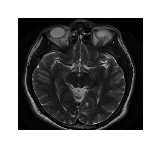
Magnetic Resonance Imaging (MRI) is a medical image technique used to sense the irregularities in human bodies. Segmentation technique for Magnetic Resonance Imaging (MRI) of the brain is one of the method used by radiographer to detect any abnormality happened specifically for brain.
In digital image processing, segmentation refers to the process of splitting observe image data to a serial of non-overlapping important homogeneous region. Clustering algorithm is one of the process in segmentation.
Clustering in pattern recognition is the process of partitioning a set of pattern vectors in to subsets called clusters.
There are various image segmentation techniques based on clustering. One example is the K-means clustering.
Image Segmentation
Let’s try the Hierarchial clustering with an MRI image of the brain.
The healthy data set consists of a matrix of intensity values.
R gives us an error that seems to tell us that our vector is huge, and R cannot allocate enough memory.
Let’s see the structure of the healthy vector.
str(healthyVector)
## num [1:365636] 0.00427 0.00855 0.01282 0.01282 0.01282 ...
n<-365636
The healthy vector has 365636 elements. Let’s call this number n. For R to calculate the pairwise distances, it would need to calculate n*(n-1)/2 and store them in the distance matrix. This number is 6.6844659 × 10¹⁰. So we cannot use hierarchical clustering.
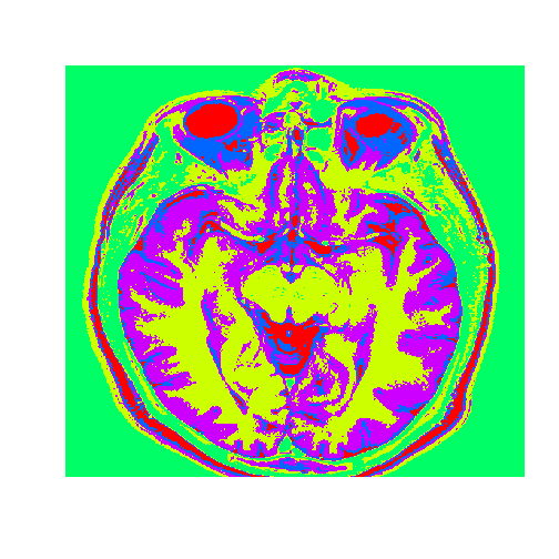
Now let’s try use the k-means clustering algorithm, that aims at partitioning the data into k clusters, in a way that each data point belongs to the cluster whose mean is the nearest to it.
# Specify number of clusters.# Our clusters would ideally assign each point in the image to a tissue class or a particular substance, for instance, grey matter or white matter, and so on. And these substances are known to the medical community. So setting the number of clusters depends on exactly what you're trying to extract from the image.k=5# Run k-meansset.seed(1)KMC=kmeans(healthyVector,centers=k,iter.max=1000)str(KMC)
## List of 9
##  $ cluster     : int [1:365636] 3 3 3 3 3 3 3 3 3 3 ...
##  $ centers     : num [1:5, 1] 0.4818 0.1062 0.0196 0.3094 0.1842
##   ..- attr(*, "dimnames")=List of 2
##   .. ..$ : chr [1:5] "1" "2" "3" "4" ...
##   .. ..$ : NULL
##  $ totss       : num 5775
##  $ withinss    : num [1:5] 96.6 47.2 39.2 57.5 62.3
##  $ tot.withinss: num 303
##  $ betweenss   : num 5472
##  $ size        : int [1:5] 20556 101085 133162 31555 79278
##  $ iter        : int 2
##  $ ifault      : int 0
##  - attr(*, "class")= chr "kmeans"
To output the segmented image we first need to convert the vector healthy clusters to a matrix.
We will use the dimension function, that takes as an input the healthyClusters vector. We turn it into a matrix using the combine function, the number of rows, and the number of columns that we want.
# Plot the image with the clustersdim(healthyClusters)=c(nrow(healthyMatrix),ncol(healthyMatrix))image(healthyClusters,axes=FALSE,col=rainbow(k))
Now we will use the healthy brain vector to analyze a brain with a tumor
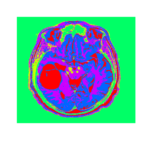
The tumor.csv file corresponds to an MRI brain image of a patient with oligodendroglioma, a tumor that commonly occurs in the front lobe of the brain. Since brain biopsy is the only definite diagnosis of this tumor, MRI guidance is key in determining its location and geometry.
Now, we will apply the k-means clustering results that we found using the healthy brain image on the tumor vector. To do this we use the flexclust package.
The flexclust package contains the object class KCCA, which stands for K-Centroids Cluster Analysis. We need to convert the information from the clustering algorithm to an object of the class KCCA.
# Apply to a test imagetumor=read.csv("tumor.csv",header=FALSE)tumorMatrix=as.matrix(tumor)tumorVector=as.vector(tumorMatrix)# Apply clusters from before to new image, using the flexclust package#install.packages("flexclust")library(flexclust)KMC.kcca=as.kcca(KMC,healthyVector)tumorClusters=predict(KMC.kcca,newdata=tumorVector)# Visualize the clustersdim(tumorClusters)=c(nrow(tumorMatrix),ncol(tumorMatrix))f<-function(m)t(m)[,nrow(m):1]# function to rotate our matrix 90 degrees clockwisetumorClusters<-f(tumorClusters)# rotation achieved by our functionimage((tumorClusters),axes=FALSE,col=rainbow(k),useRaster=TRUE)
The tumor is the abnormal substance here that is highlighted in red that was not present in the healthy MRI image.
The singular value decomposition (SVD) is a factorization of a real or complex matrix. It has many useful applications in signal processing and statistics.
Singular Value Decomposition
SVD is the factorization of a \( m \times n \) matrix \( Y \) into three matrices as:
With:
\( U \) is an \( m\times n \) orthogonal matrix
\( V \) is an \( n\times n \) orthogonal matrix
\( D \) is an \( n\times n \) diagonal matrix
In R The result of svd(X) is actually a list of three components named d, u and v,
such that Y = U %*% D %*% t(V).
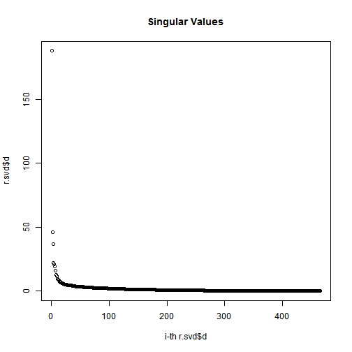
# Apply SVD to get u, v, and dr.svd<-svd(r)u<-r.svd$uv<-r.svd$vd<-diag(r.svd$d)dim(d)
## [1] 465 465
## [1] 465 465
Plot the magnitude of the singular values
# check svd$d values # Plot the magnitude of the singular valuessigmas=r.svd$d# diagonal matrix (the entries of which are known as singular values)plot(1:length(r.svd$d),r.svd$d,xlab="i-th r.svd$d",ylab="r.svd$d",main="Singular Values");
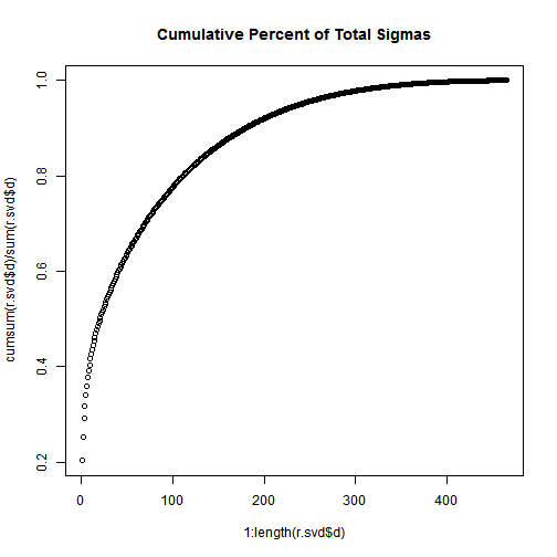
plot(1:length(r.svd$d),cumsum(r.svd$d)/sum(r.svd$d),main="Cumulative Percent of Total Sigmas");
Not that, the total of the first n singular values divided by the sum of all the singular values is the percentage of “information” that those singular values contain. If we want to keep 90% of the information, we just need to compute sums of singular values until we reach 90% of the sum, and discard the rest of the singular values.
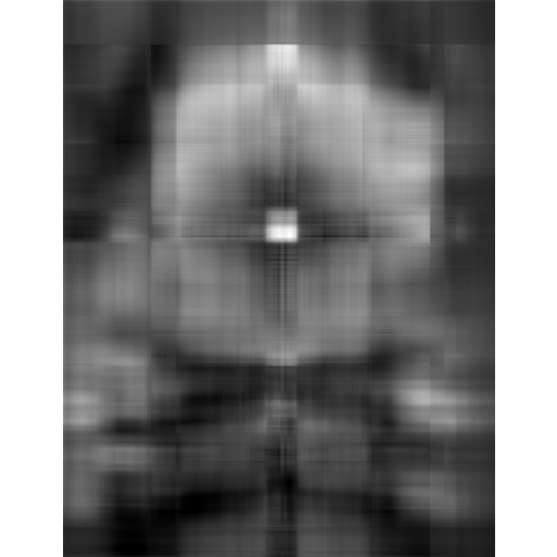
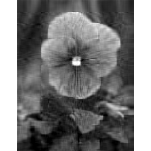
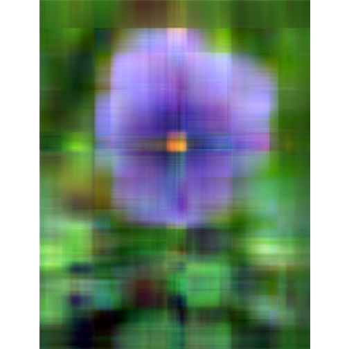
# first approximationu1<-as.matrix(u[-1,1])v1<-as.matrix(v[-1,1])d1<-as.matrix(d[1,1])l1<-u1%*%d1%*%t(v1)l1g<-imagematrix(l1,type="grey")#plot(l1g, useRaster = TRUE)display(l1g,method="raster",all=TRUE)
# more approximationdepth<-5us<-as.matrix(u[,1:depth])vs<-as.matrix(v[,1:depth])ds<-as.matrix(d[1:depth,1:depth])ls<-us%*%ds%*%t(vs)lsg<-imagematrix(ls,type="grey")## Warning: Pixel values were automatically clipped because of range over.#plot(lsg, useRaster = TRUE)display(lsg,method="raster")
# more approximationdepth<-20us<-as.matrix(u[,1:depth])vs<-as.matrix(v[,1:depth])ds<-as.matrix(d[1:depth,1:depth])ls<-us%*%ds%*%t(vs)lsg<-imagematrix(ls,type="grey")## Warning: Pixel values were automatically clipped because of range over.#plot(lsg, useRaster = TRUE)display(lsg,method="raster")
Image Compression with the SVD
Here we continue to show how the SVD can be used for image compression (as we have seen above).
We can think of an image as a function, f, from (or a 2D signal):
f (x,y) gives the intensity at position (x,y)
Realistically, we expect the image only to be defined over a rectangle, with a finite range:
f: [a,b]x[c,d] -> [0,1]
A color image is just three functions pasted together. We can write this as a “vector-valued” function:
Computing Transformations
If you have a transformation matrix you can evaluate the transformation that would be performed by multiplying the transformation matrix by the original array of points.
Examples of Transformations in 2D Graphics
In 2D graphics Linear transformations can be represented by 2x2 matrices. Most common transformations such as rotation, scaling, shearing, and reflection are linear transformations and can be represented in the 2x2 matrix. Other affine transformations can be represented in a 3x3 matrix.
Rotation
For rotation by an angle θ clockwise about the origin, the functional form is \( x’ = xcosθ + ysinθ \)
and \( y’ = − xsinθ + ycosθ \). Written in matrix form, this becomes:
Scaling
For scaling we have \( x’; = s_x \cdot x \) and \( y’; = s_y \cdot y \). The matrix form is:
Shearing
For shear mapping (visually similar to slanting), there are two possibilities.
For a shear parallel to the x axis has \( x’; = x + ky \) and \( y’; = y \) ; the shear matrix, applied to column vectors, is:
A shear parallel to the y axis has \( x’; = x \) and \( y’; = y + kx \) , which has matrix form:
Image Processing
The package EBImage is an R package which provides general purpose functionality for the reading, writing, processing and analysis of images.

/unnamed-chunk-6-1.png)


 Not that, the total of the first n singular values divided by the sum of all the singular values is the percentage of “information” that those singular values contain. If we want to keep 90% of the information, we just need to compute sums of singular values until we reach 90% of the sum, and discard the rest of the singular values.